.png)
Their welcome email is fine. That's the problem.
If you want one of yours rebuilt like this, the form at the bottom is how to start.
BEFORE

AFTER

The before says things. The after creates actions.
Every change has a job.
01
No more hide and seek.
The offer is now front and center. Previously, the user had to make it through lots of text before stumbling on the discount code they signed up for.

After
02
Improved text lock treatment.
The update uses space and styling to make the required copy feel less daunting to read.

After
03
Increased clickable moments.
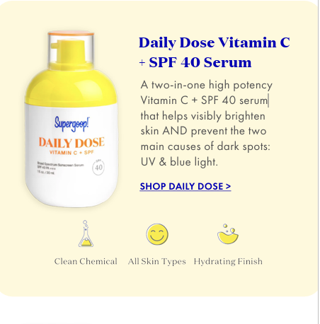
We've added products and collection callouts to create clickable moments for the end user. They came to shop, so we want to help make that happen!
After