.png)
Their welcome email is fine. That's the problem.
If you want one of yours rebuilt like this, the form at the bottom is how to start.
BEFORE

AFTER
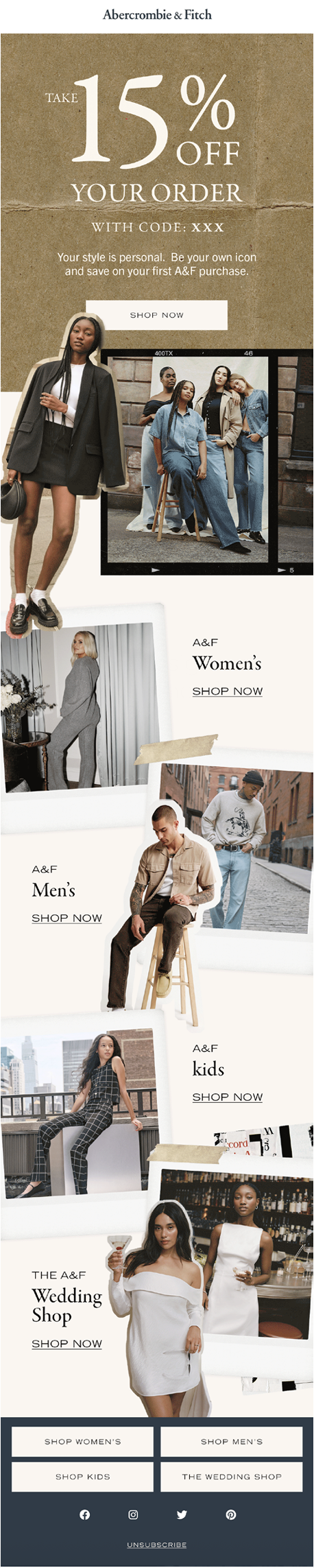
The before says things. The after creates actions.
Every change has a job.
01
Less bland. More Focus.
The original email was uninspiring and made the user look for information. The update puts the core message front and center.

After
02
Create the vibes.
The original black-and-white image was uninspiring, featuring a person wearing a random pair of jeans. The brand has reinvented itself, and we decided to showcase it visually.

After
03
Create clickable moments.
Nothing about the original email made the customer want to click. We've added in collections and fresh imagery to help create more clickable moments.

After